
Transform your bedroom into a cozy autumn retreat—with surprising twists of color that delight the senses.
When most people think of fall decor, warm neutrals, pumpkin oranges, and harvest browns dominate the palette. But what if you could elevate your bedroom this season with unexpected color pops that feel fresh, modern, and totally “you”? Whether you’re looking to create a designer-level space or just want to break free from typical autumn tones, these ideas will help you infuse bold beauty into your fall bedroom design—without losing that cozy seasonal charm.
Here are 10 unexpected color pop ideas to make your fall bedroom decor unforgettable.
Table of Contents
- Teal Throw Pillows & Blankets
- Plum and Gold Bedding Accents
- Mint Green Nightstand or Decor
- Coral Curtains or Drapes
- Navy Blue Accent Wall
- Mustard Yellow Lampshades
- Blush Pink Bed Linen Layering
- Burnt Orange Wall Art
- Chartreuse Accents
- Indigo and Terracotta Rug
- Final Tips for Using Color Pops in Fall Bedroom Decor:
- Conclusion
Teal Throw Pillows & Blankets
Why It Works: Teal is a rich, jewel-toned color that pairs beautifully with mustard yellows and burnt oranges—adding a cool contrast to the traditional warm palette.
How To Do It:
- Swap out existing throw pillows for velvet teal ones.
- Add a teal knit blanket at the foot of your bed.
- Layer with neutral bedding to let the teal shine.
Tip: Choose textures like velvet or chunky knit to stay in tune with the fall theme.
Plum and Gold Bedding Accents
Why It Works: Deep plum adds a regal, moody vibe, while gold brings in luxurious warmth.

How To Do It:
- Add plum pillowcases and a matching throw.
- Accent with gold-trimmed lamp bases, candle holders, or wall art.
Tip: Metallic gold finishes reflect light, making the space feel more vibrant and dynamic.
Mint Green Nightstand or Decor
Why It Works: Mint adds a refreshing pop that unexpectedly complements earthy fall shades like copper and camel.
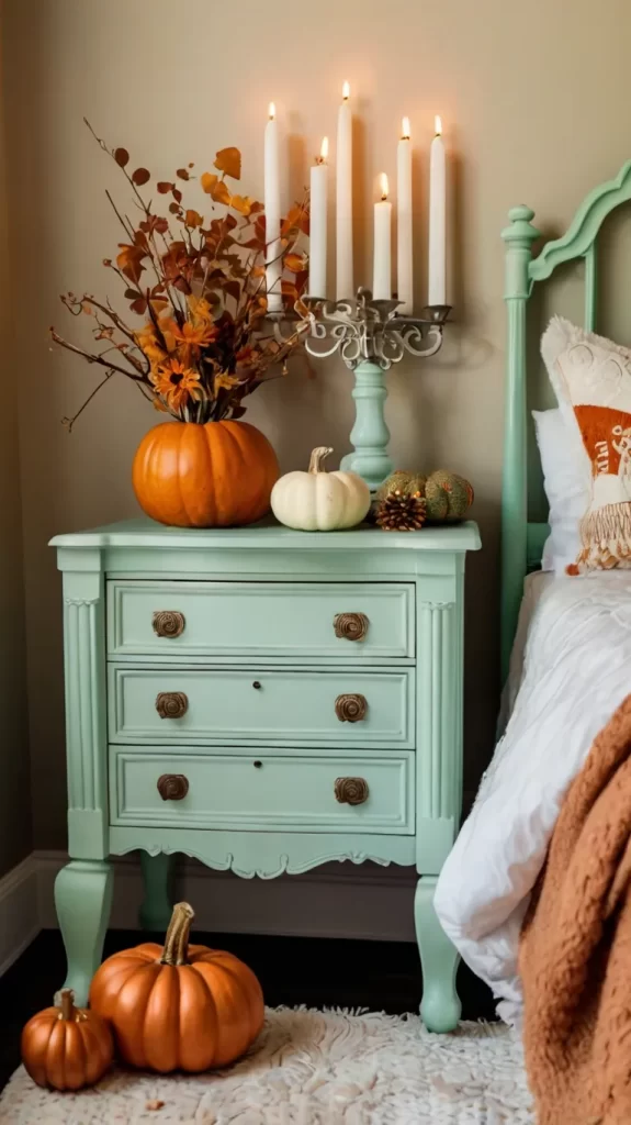
How To Do It:
- Paint a nightstand or chair in soft mint.
- Add mint vases or ceramic candle holders on shelves.
Tip: Choose matte finishes to maintain the cozy, fall feeling.
Coral Curtains or Drapes
Why It Works: Coral brings lively energy and warmth that feels modern without clashing with fall tones.

How To Do It:
- Replace summer sheers with coral velvet or linen drapes.
- Match with a few coral-toned accents like a throw or lamp.
Tip: Layer curtains with light beige sheers to soften the look.
Why It Works: Navy adds depth and coziness while contrasting beautifully with burnt sienna and ochre tones.

How To Do It:
- Paint one wall behind the bed in matte navy.
- Complement with rust or copper bedding.
Tip: Use peel-and-stick wallpaper in navy for a rental-friendly option.
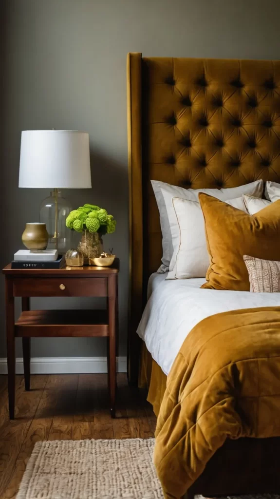
Mustard Yellow Lampshades
Why It Works: Mustard offers warmth and a vintage vibe, and it stands out nicely against cooler or neutral walls.

How To Do It:
- Swap lampshades for mustard yellow ones.
- Add a matching throw pillow or small area rug to tie it together.
Tip: Use Edison bulbs to enhance the cozy ambiance.
Blush Pink Bed Linen Layering
Why It Works: Blush pink is soft, romantic, and pairs wonderfully with taupe and cinnamon tones.

How To Do It:
- Add a blush duvet or sheet set.
- Accent with rose gold or copper decor.
Tip: Keep it monochromatic with variations of blush for a modern touch.
Burnt Orange Wall Art
Why It Works: Burnt orange is a classic fall color, but using it in modern art feels fresh and unexpected.
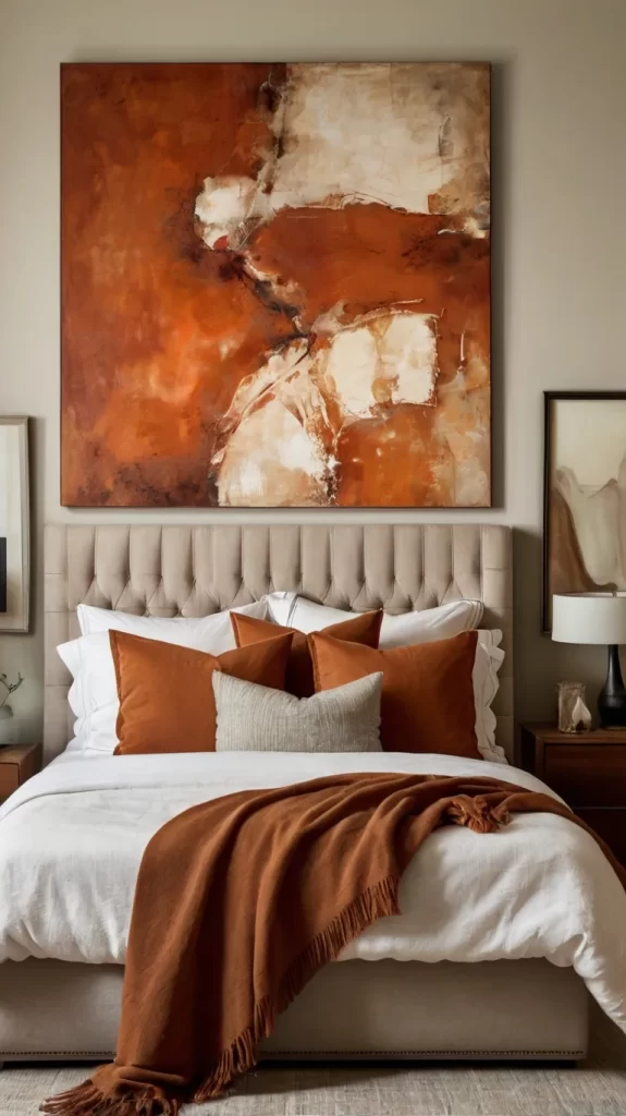
How To Do It:
- Hang abstract or line art prints in burnt orange tones.
- Pair with a minimalist frame to let the color stand out.
Tip: Mix media with canvas, textiles, or metal art pieces.
Chartreuse Accents
Why It Works: Chartreuse (yellow-green) adds energy and an avant-garde twist that feels bold yet cozy when balanced with dark tones.
How To Do It:
- Use chartreuse in a throw pillow or upholstered bench.
- Layer with brown and caramel bedding for balance.
Tip: Don’t overdo it—1-2 small chartreuse accents are enough for big impact.
Indigo and Terracotta Rug
Why It Works: This unexpected color combo offers boho fall charm that’s warm and grounding.

How To Do It:
- Lay down a patterned rug in deep indigo and terracotta.
- Pull accent colors from the rug into your decor.
Tip: Use the rug as the focal point and build your palette around it.
Final Tips for Using Color Pops in Fall Bedroom Decor:
- Stick to 2-3 main accent colors to keep your palette cohesive.
- Balance bolds with neutrals to avoid visual overload.
- Layer textures like velvet, linen, and wood to maintain warmth and coziness.
- Add seasonal elements like dried florals, pumpkins, or acorns that complement your color choices.
- Light strategically with warm-toned bulbs to make colors glow softly.
Conclusion
Incorporating unexpected color pops in your fall bedroom decor is the perfect way to stand out while still embracing the cozy, comforting vibe of the season. Whether you’re painting an accent wall or swapping throw pillows, these small changes can make a big impact—and wow your guests (or just yourself!) every time you walk in.
Ready to add some color to your fall bedroom refresh? Let your creativity guide you!